Design system in practice
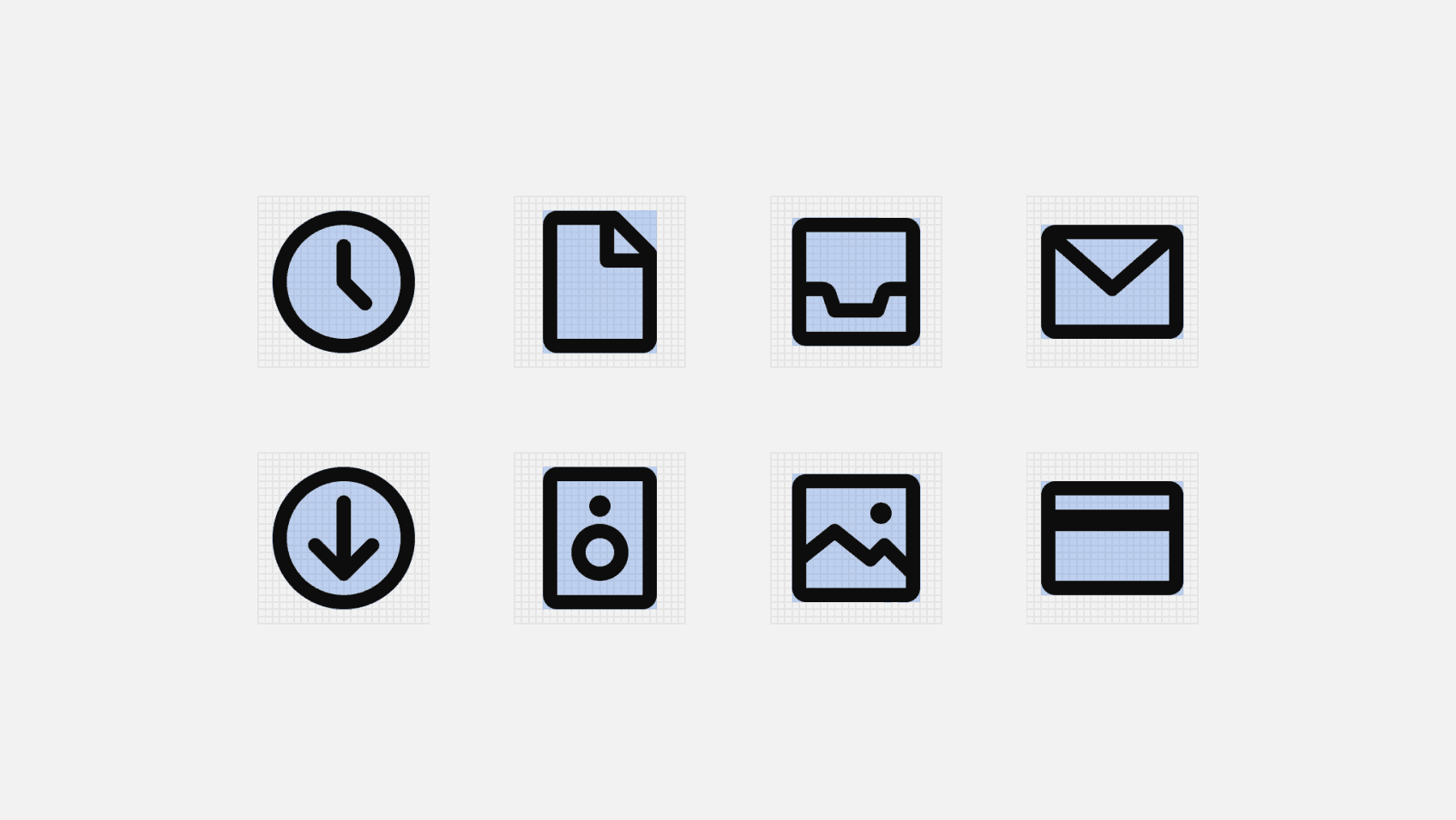
Icons
Smart uses Mono Icons as its default system icon set. Mono Icons is a simple, consistent open-source icon set designed to be used in a wide variety of digital products.
Expanding the icon set
In case there's a need to create extra icons for the Smart app that are not existing in the current Mono Icons set, we recommend to follow the following guidelines to design them.
To make sure all icons feel consistent and follow a unified style and approach, Mono Icons have a basic set of rules and design principles that are used as the foundation to design the whole set. This includes decisions concerning grid, padding, keylines, strokes and even the treatment of corner radiuses.
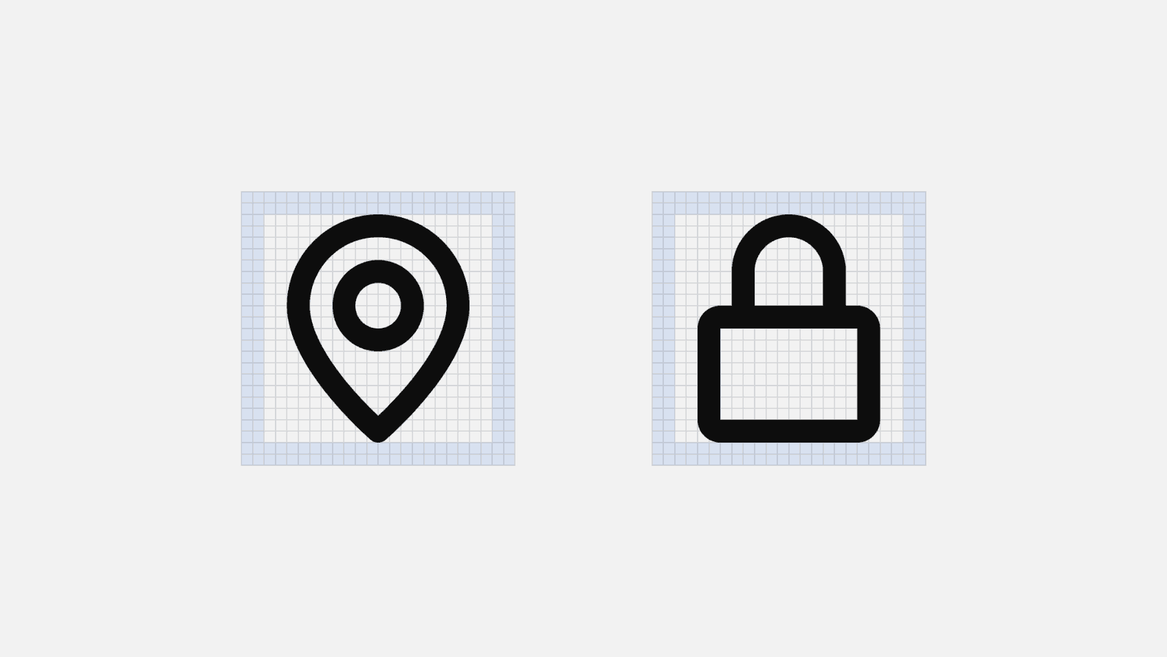
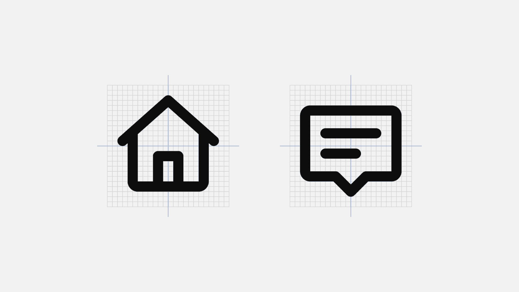
Grid
Mono Icons are designed on a pixel-based grid of 24px × 24px, which is used as a base to determine shape, positioning and proportion across the entire set of icons.
Padding
The icon’s boundary box also contains a 2px padding. This gives all icons a similar white space around them, which also makes the set look more visually balanced. Try to keep the icons always within the area defined by the padding, only extend shapes into the padding area in the (rare) cases where the icon requires some extra visual weight.
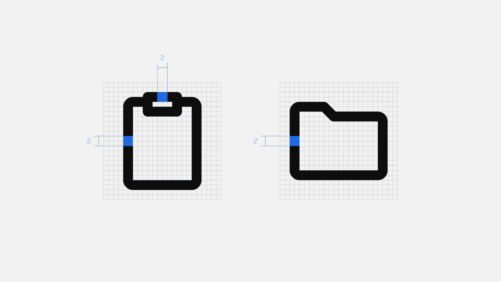
Keylines
Besides the grid and the padding, keyline shapes are the third big foundation of Mono Icons’ design. They’re basically a group of simple, core shapes that help maintaining consistent visual proportions across icons. If some of your icons have a similar proportion or shape, you can use keyshapes to ensure that all icons that share those visual characteristics are aligned.
Strokes
To keep overall consistency and a balanced visual weight across the set, Mono Icons use a 2px stroke for all icons. There could be, of course, some exceptions to this rule, for example in those cases where an icon is too complex for the default 2px stroke thickness.
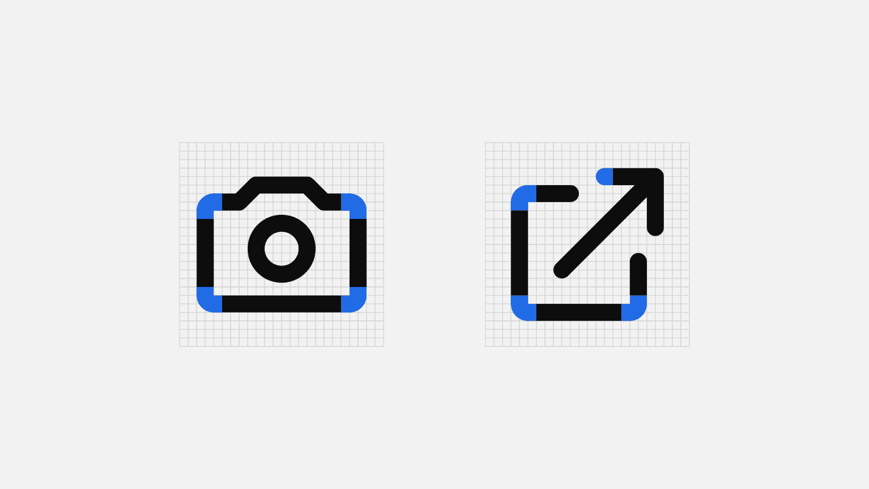
Corners
Mono Icons also use a (somewhat) consistent corner radius of 1px, with the exception of interior corners, which are square. Why is it “somewhat” consistent? Because the roundness of some corners or shapes may depend on the object the icon is representing. Try to avoid forcing rounded corners on some objects or shapes that might make them unrecognisable. Make sure to also round all terminals and joints of every shape.
Alignment
In icon design (and in design in general really), sometimes aligning shapes metrically won’t cut it, that’s why Mono Icons are optically aligned within the boundary box. This ensures that all icons look properly aligned when used side by side and overall just makes the whole set look visually balanced.
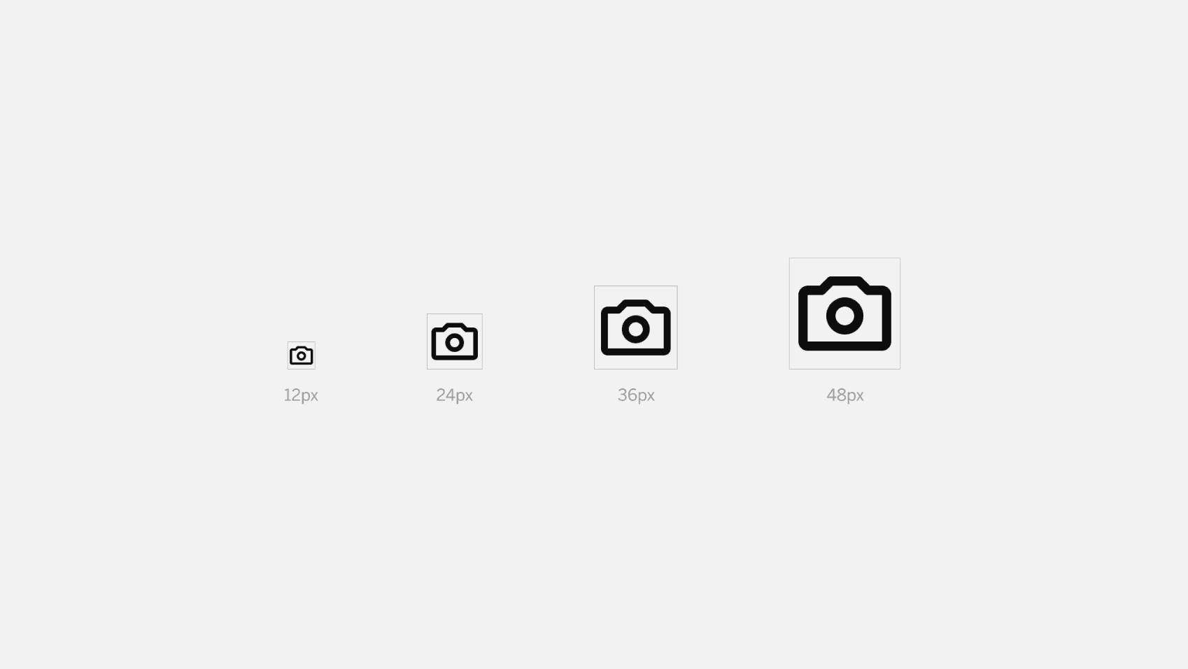
Size
Like we’ve mentioned before, Mono Icons have been designed in a 24px × 24px grid, so we recommend using them at a 100% scale for pixel-perfect accuracy. Another option is to use them at a multiple size of 12 to ensure that the icons are displayed sharply.